
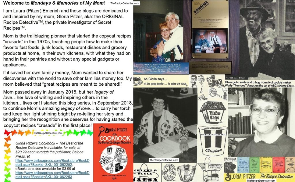
Thank God Its Monday again and, as such, #HappyMonday to everyone! I look forward to Mondays because they’re my 52 Chances a year, in which I get to share Memories of My Mom with you!
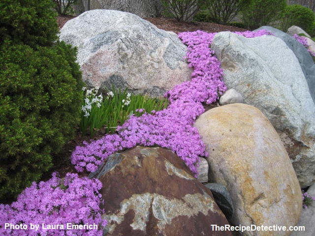
The harmonized arrivals of Spring, Easter, and April bring with them “new life” and fresh colors. Mother nature is decorating with bright pops of colors all over the place – in the tulips, daffodils, and hyacinths, just to name a few! Similarly, April celebrates National Decorating Month!
Decorating goes hand-in-hand with my spring cleaning ritual of moving the furniture around. I also switch out my dark, winter accent colors with my lighter, brighter, spring tones. I do this through simple changes in the curtains, throw blankets, and decorative pillows. Color is one of the most effective and in-expensive components in decorating.
In the 1980s and 1990s, I sold attractive accessories (at in-home gatherings) from a Texas-based company, called Home Interiors & Gifts. It was one of my favorite jobs. I loved meeting new people in small, home gatherings and teaching them about decorating, like the Home Interiors’ team taught me.
I learned a lot of wonderful decorating techniques from my HI&G sales team. I also learned great social skills, public speaking, and selling techniques. I especially loved learning about Feng shui and color psychology.
Carl Jung is the pioneer of color psychology [aka: colorology] – the study of how colors affect our perceptions and behaviors. He’s well-known for his investigations into color properties and their effects on emotions. Color is used to represent so many different things.
Astrology includes color association in the various zodiac signs, having main “power” colors that represent certain characteristics. According to Taylor Markarian’s interesting read (updated: 02/21/2023) at Reader’s Digest [rd.com], Aries is denoted by red.
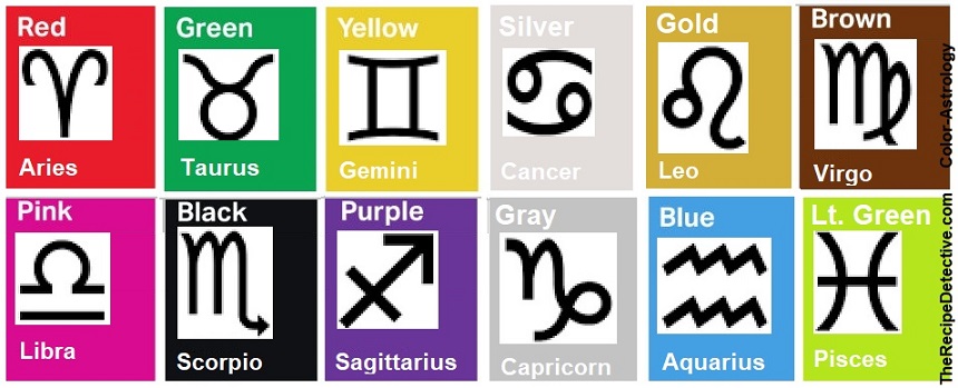
I thought red was an appropriate choice, as Aries is the first sign of the zodiac and, from what I remember learning in a college child psychology class years ago, it’s the first primary color infants focus on, as their vision improves after birth.
Continuing on, Markarian claims Taurus is represented by green – bulls do love to eat grass. Gemini [aka: “the twins”] is represented by happy yellow. Cancer [aka: “the crab”] is represented by glamorous silver and Leo [aka: “the lion”] is represented by gold – like his golden mane.
Virgo follows, represented by natural, down-to-earth brown. Libra is “pretty in pink”. Scorpio is dramatic in black and Sagittarius is represented by ambitious purple, while Capricorn is represented by solid, dependable gray (and brown).
Aquarius is aptly represented by blue – the color of water. Likewise, Pisces [aka: “the fish”] is represented by a light shade of green – like a rainbow trout. Keep in mind that color associations and representations can vary by region and many other factors.
Interestingly, since every zodiac sign is ruled by at least one planet, every planet likewise has at least one color that represents its characteristics. According to NASA.gov, Mercury is represented by grey. Venus is represented by brown and grey. Earth is represented by blue, as well as brown, green, and white.
Mars is represented by red, as well as brown and tan. Jupiter is represented by brown, orange, and tan, with white cloud stripes. Saturn is represented by golden brown and bluish gray. Uranus is represented by the tertiary color blue-green. And, last but not least, Neptune is represented by blue.
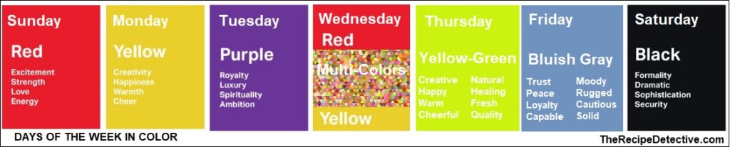
Additionally, according to Color-Meanings.com, even the seven days of the week are represented by at least one color. The first day – Sunday – like the first zodiac sign, is similarly represented by energizing red. I especially like that Monday is represented by HAPPY yellow.
Additionally, Tuesday is represented by ambitious purple. Wednesday [aka: “hump day”] is represented by yellow, red and/or multi-colors. Thursday is represented by the creative freshness of yellow-green (a tertiary color). Friday is represented by a trustworthy but cautious bluish gray. Finally, Saturday is represented by dramatic black.
At SteelKaleidoscopes.typepad.com, I found an interesting interpretation of which colors represent each of the twelve months of the year. According to If Months Were Colors (Author unknown; Oct. 31, 2009), January is represented by white, as it’s a snowy, fresh start to the year. I agree.
February is represented by red, due to Valentine’s Day [which is the heart of the month (pun intended)]. The writer then suggests gray represent March, for [moody] “cabin fever” and the color of the snowbanks along the sides of the roads. I think March is better represented by green for St. Patrick’s Day and the beginning of spring.
The page also suggests that April is best represented by pink because of the blossoming spring flowers and May is best represented by blue because of growing optimism in the warming days. I think light purple [aka: lilac] is a better color for May, as that’s when lilacs start blooming.
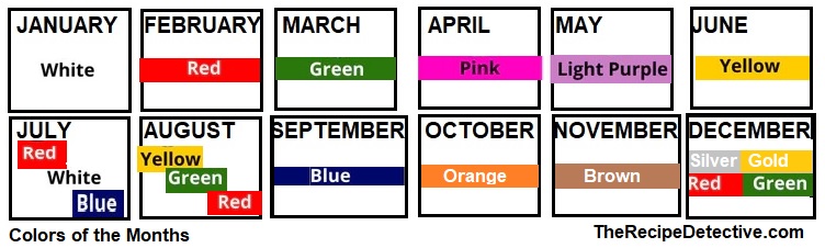
June is yellow for “sunshine, beaches and good cheer”; while July is orange for the “searing” summer heat. For obvious reasons, I think red, white, and blue better represents July. August is represented by gold, as summer heat peaks. I’d link August to summer harvest colors – orange, yellow, green, and red for tomatoes, peppers, corn, summer squash, and melons.
The page also suggests purple for September, acquainting it to school colors, civic pride and productivity. I think blue is a better representative of September for knowledge, intuition, imagination, inspiration (and going back to school). Go Blue!
October is obviously represented by orange for Halloween [and pumpkins] and fall leaves. November is represented by brown for the cornucopia of the fall harvest and Thanksgiving turkeys. Last but not least, December is aptly represented by green and red for Christmas. Silver and gold are also good representatives of December, for that matter.
Color is a persuasive marketing tool, about which I wrote in The Color Effect. Marketing concepts use color theory to elicit certain feelings or psychological effects from potential consumers. In fact, there’s been a lot of studies done on the various effects colors have on us, in general. The Cause & Effect of color is a fascinating subject.
How to Use the Psychology of Colors When Marketing, by DashBurst (June 19, 2014; updated Sep. 7, 2021), as seen at SmallBizTrends.com, admits that “The psychology of color is used in advertising and marketing to evoke emotional reactions.” The article also includes an interesting history about colors.
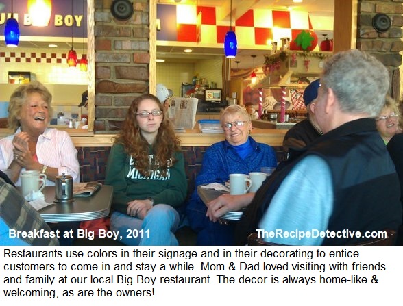
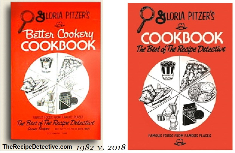
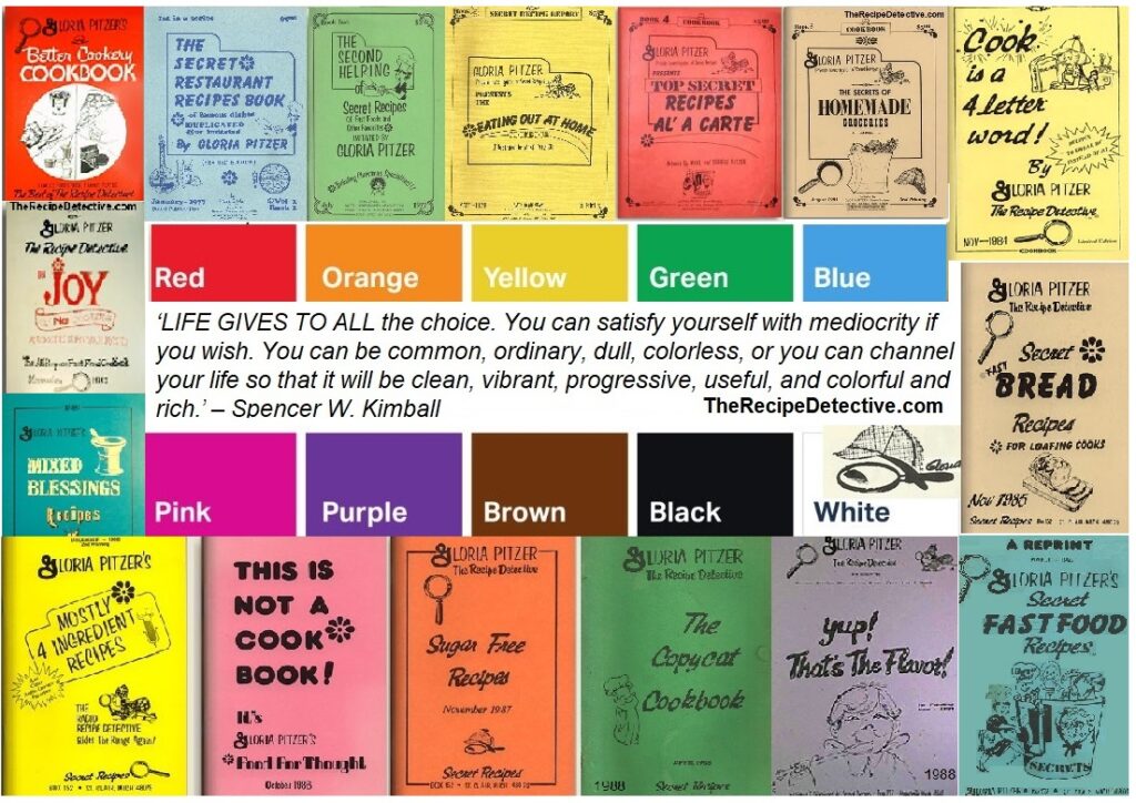
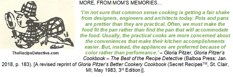
Mom had a knack for decorating, herself. Maybe it’s in our “artistic/creative genes”. However, certain color schemes and styles are more popular by region and time eras. Mom also used colorology when she chose the cover colors for each of her self-published books.
Color theory is an assortment of guidelines designers use to present appealing and visually interesting color harmonies or schemes, using the color wheel (as well as color psychology). Colors are neatly organized on an illustrative tool called a color wheel, starting with the three primary colors – red, blue, and yellow – placed equally apart on the wheel.
A 50-50 combination of any two primary colors makes one of the three secondary colors – orange, purple, green – placed appropriately between each of those, on the wheel. Likewise, there are six tertiary colors, between each of the primary and secondary colors. Tertiary colors come from combining a primary color with its adjacent secondary color.
The colors of the wheel are categorized into cool and/or warm temperatures. Cool colors include green, blue, purple, and the tertiary colors between them. Cool colors often remind us of grass, water/sky, and flowers (lavender/lilacs), creating a calm and soothing effect. I’ve noticed that the Northern Lights often appear in this range of colors, as well.
Warm colors include red, orange, yellow, and the tertiary colors in between them. Warm colors are often energizing and brilliant, even mesmerizing; reminding us of things like campfires, sunrises, and sunsets. High-energy bees and hummingbirds are very attracted to warm colors.

Neutral colors, such as white, grey, and black are neither warm nor cool. Brown is a hybrid that’s created from both warm and cool colors. Different shades of brown are made by combining two opposite colors on the “wheel”, such as red and green, yellow and purple, or blue and orange.
Many companies choose colors for their brands or logos that best represent them and indicate certain values. For example, KFC and Coke are associated with red, which indicates fun and excitement.
Culver’s and Pepsi’s logos are primarily in trustworthy blue. Similarly, Subway’s and Starbuck’s logos are green, which is often associated with being organic and/or fresh. Likewise, McDonald’s uses exciting red and happy yellow in its logo and décor.
People psychologically associate colors with certain things – like green grass, blue water, yellow sun, and white clouds, to name some general examples. Yet, people are so different – children to adults, females to males, and so on – that personal associations with any one color can vary greatly. It all comes down to individual interpretation.
LAST THOUGHTS…
Having said that, however, there’s a lot of common color associations, about which I learned, while selling the Home Interiors & Gifts products. Overall, color associations are timeless. Here’s my generalized list of colors associations.
-
- Purple, like its two ingredients (red and blue), is associated with power, confidence, trust, and loyalty. Purple is also associated with royalty, elegance, authority, and seniority.
- Blue is associated with loyalty, trust, calmness, peace, and stability. Blue is also associated with first-place ribbons and being a winner. Indigo is a dark shade of blue that adds a deep, dramatic, intensity to blue’s general effects.
- Green, like its two ingredients (yellow and blue), is usually associated with inner peace and joy; as well as with growth, good taste, freshness, and It evokes feelings of a healthy and organic environment. Green is also associated with luck, money, success, and goodwill.
- Yellow is associated with sunshine, joy, and energy. It’s bright and happy, which stirs up feelings of confidence, ingenuity, and artistic creativity.
Mom did all the decorating in our houses when I was growing up. I remember our kitchen in Algonac having yellow and blue accents. Gold and green accents were in the living room and the bedroom I shared with my two sisters was adorned with purple accents.
-
- Orange, like its two ingredients (red and yellow), is associated with power and energy. Orange generates sociability, fun, and innovation. It’s not just for Halloween anymore!
- Red is associated with leadership and confidence. It’s very active and grabs your attention, creating feelings of excitement, power, and strength. Red is synonymous with the heart, passion, and love. Pink is a light tint of red (mixed with white), simplifying the effects by adding a bit of youth and innocence.
- Brown is associated with characteristics of being down-to-earth, natural, trustworthy, dependable, and sturdy (like a tree). Bronze is a metallic brown, with similar associations. Metallic décor adds classic and/or modern elements.

-
- Black is associated with modern and traditional characteristics; representing perfection, drama, sophistication, primness and formality.
- Grey is moody and stormy. But it’s also considered to be rugged, conservative, and solid (like a rock).
- White is innocent and heavenly, like clouds and angels’ wings. It’s simple, honest, new, and clean.
- Silver is a metallic associated with wealth, prosperity, strength, stability, glamour, grace, and elegance. It is modern, innovative, influential, refined, sleek, and sophisticated. Silver is also linked to the celestial energies of the moon and stars.
- Gold is another metallic, similar to yellow in color but its associations are more like purple’s – royalty, elegance, authority, and seniority. Gold also represents pedigree, power, confidence, and wealth.

IN CLOSING…
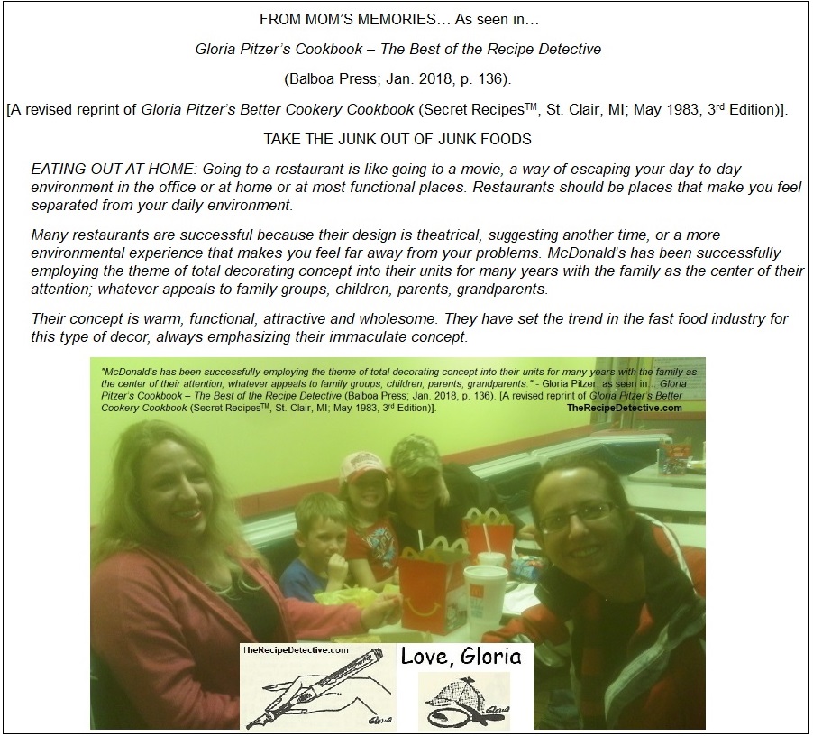
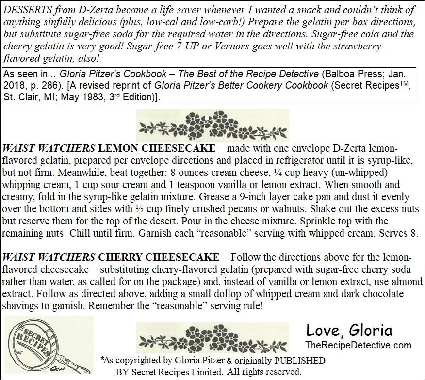
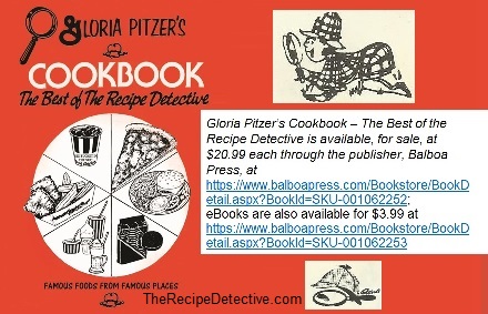
In honor of next Sunday, being National Cherry Cheesecake Day, here’s Mom’s secret recipes for Waist Watcher Cheesecake, in 2 versions, lemon and cherry; as seen in… Gloria Pitzer’s Cookbook – The Best of the Recipe Detective (Balboa Press; Jan. 2018, p. 286). [A revised reprint of Gloria Pitzer’s Better Cookery Cookbook (Secret RecipesTM, St. Clair, MI; May 1983, 3rd Edition)].
…16 down and 36 to go!